Valley Obesity Medicine & Diabetes

Branding for Medical Practices

Refining a Brand Without Starting Over

When Dr. Li first came to LovelyPixels, Valley Obesity Medicine & Diabetes already had a logo. More importantly, that logo was already out in the world. It had been used on business cards, incorporated into signage and attached to a physical practice that was quickly moving toward opening day.

That created a different kind of branding challenge.

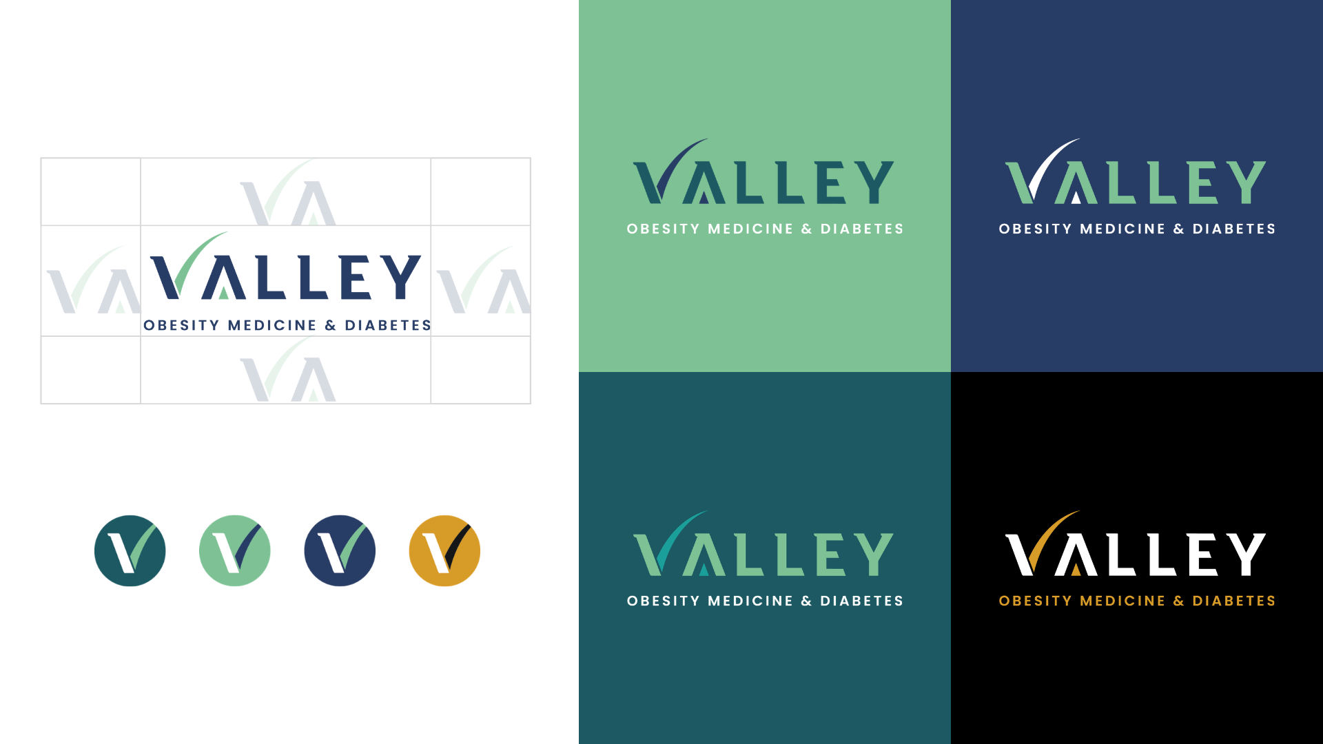
Starting over simply for the sake of putting our own creative stamp on VOMD didn’t make sense. Instead, our job was to look at what already existed, identify what was worth preserving and build a more polished, professional visual system around it—one that could support the level of credibility Dr. Li wanted his new medical practice to convey.

One moment from our very first meeting perfectly captured why that mattered.

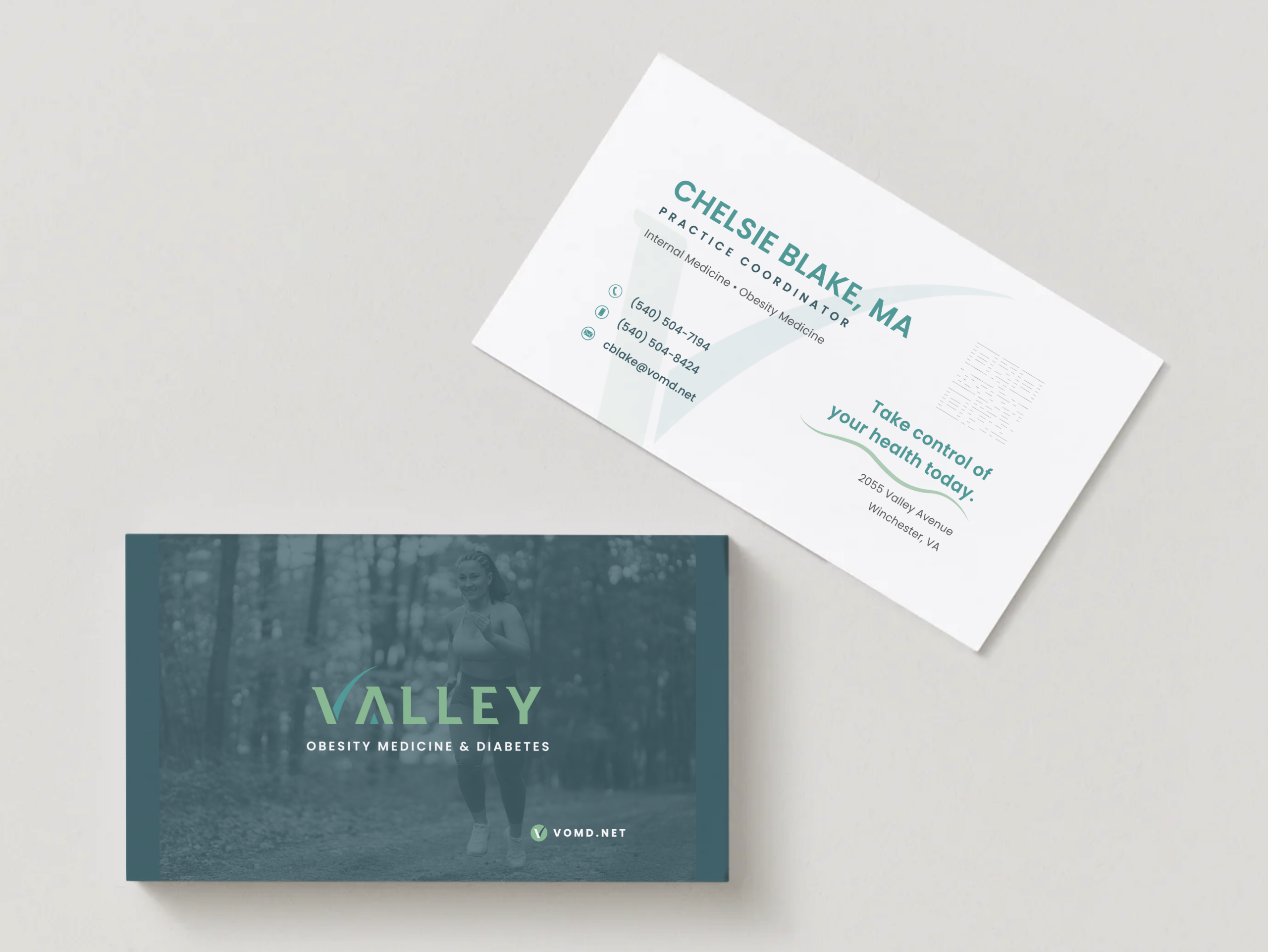
Dr. Li handed our team his existing business card. And his name was spelled wrong.

It was a tiny mistake with an outsized impact, particularly after Dr. Li had just explained how seriously he viewed attention to detail. His perspective was rooted in medicine: details matter.

A small oversight can have enormous consequences. While a typo on a business card certainly isn’t a medical emergency, it became an immediate example of the disconnect between the quality of care he intended to provide and the quality of the brand representing him.

So we tightened everything up.

Deep dive on specific areas of this project:

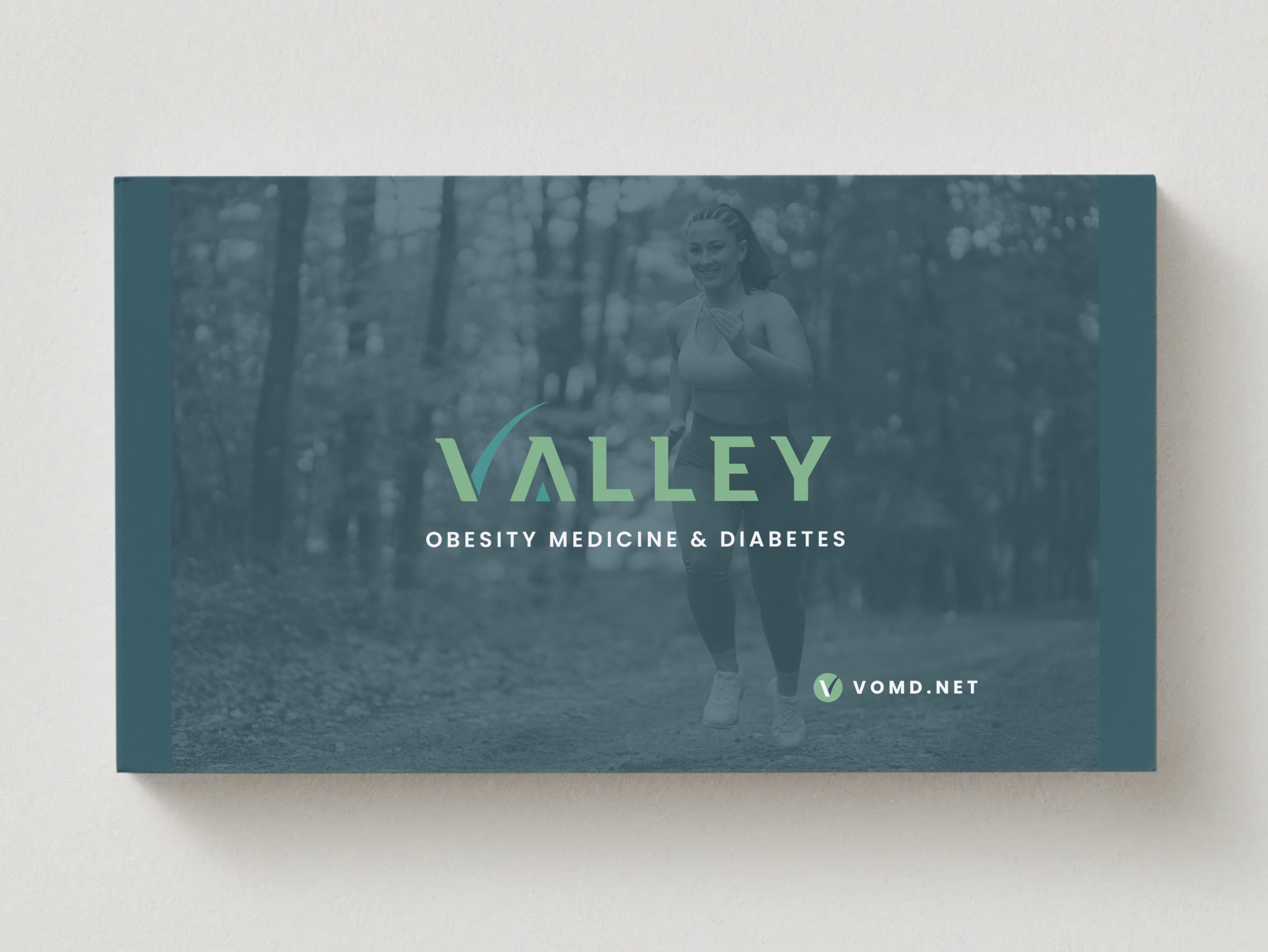
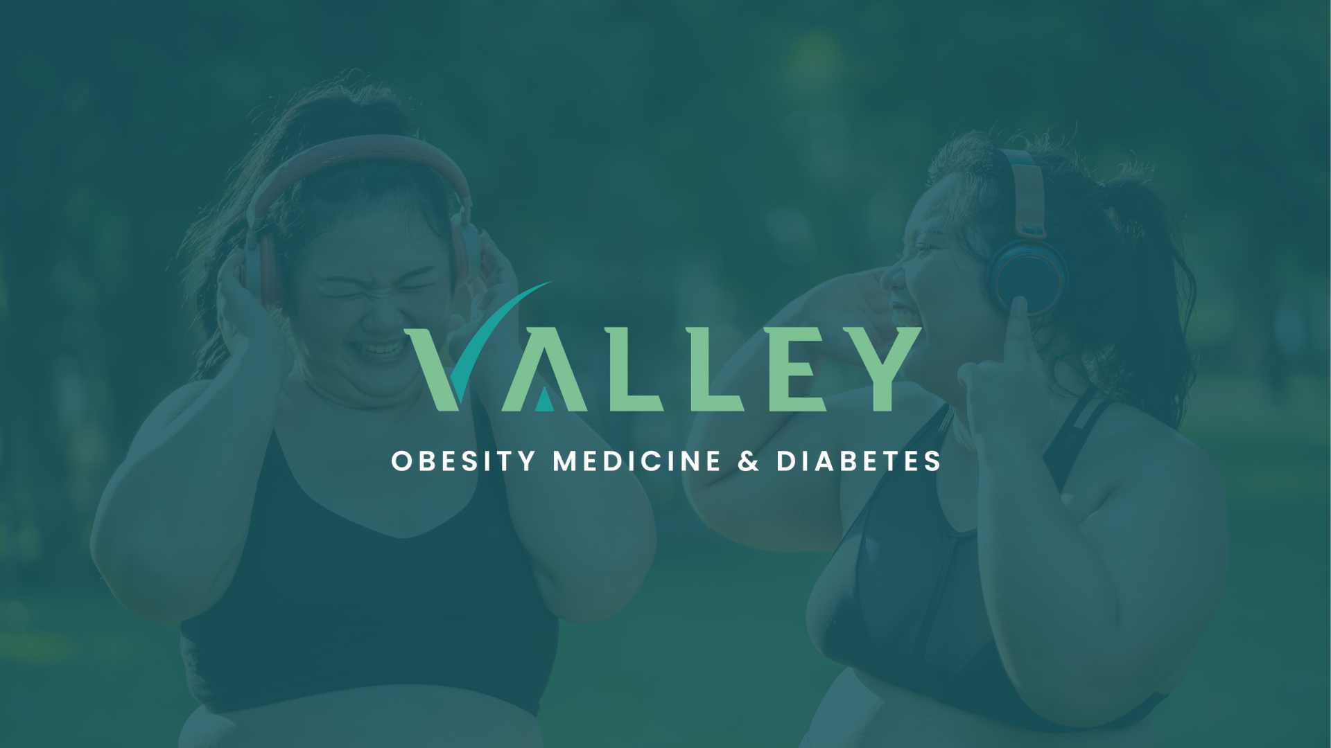
LovelyPixels refined the existing logo rather than unnecessarily replacing it.

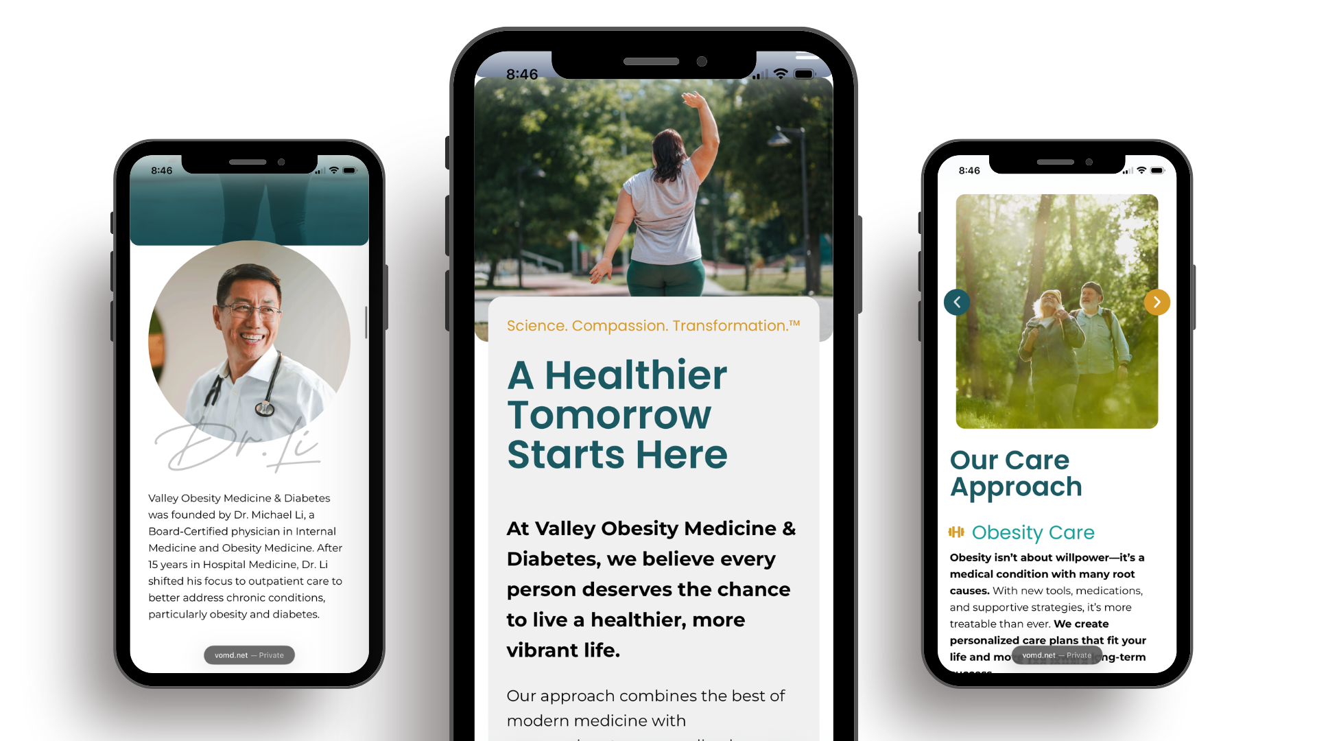
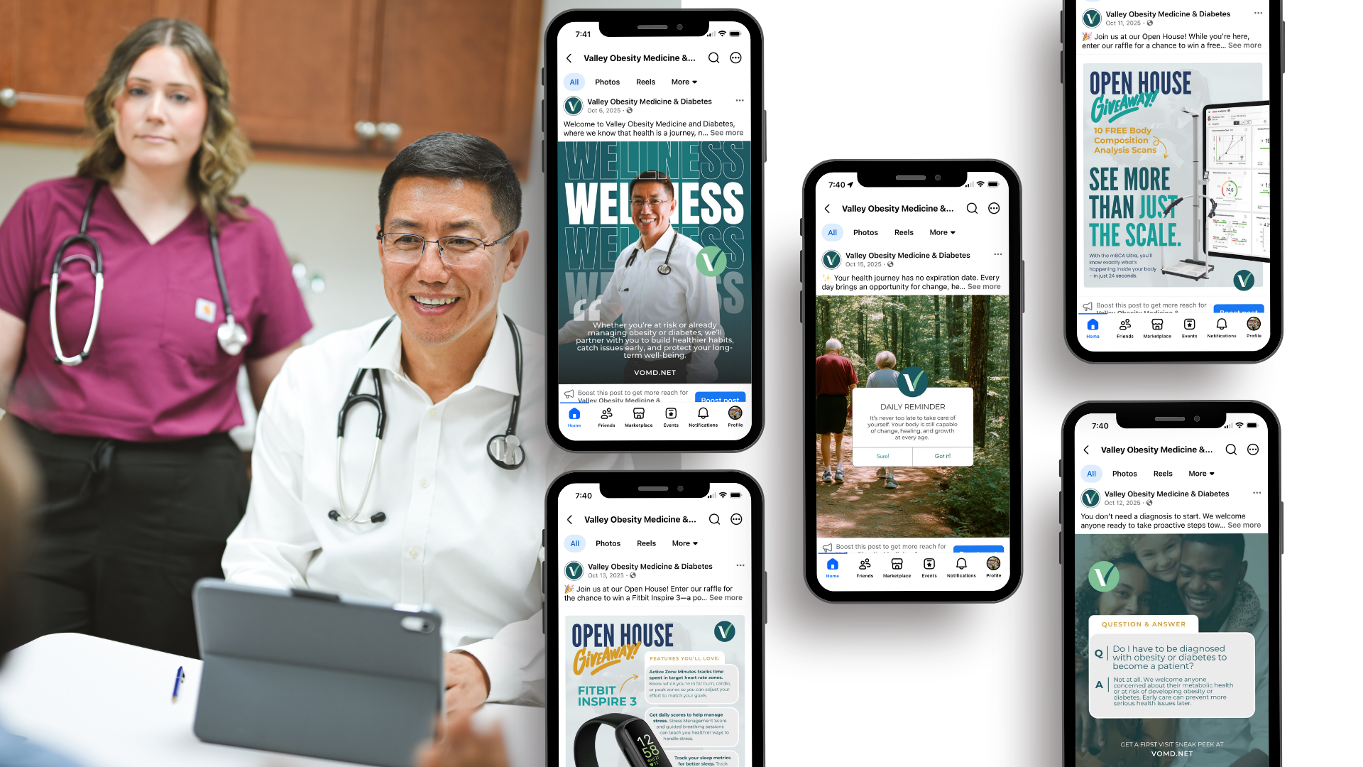
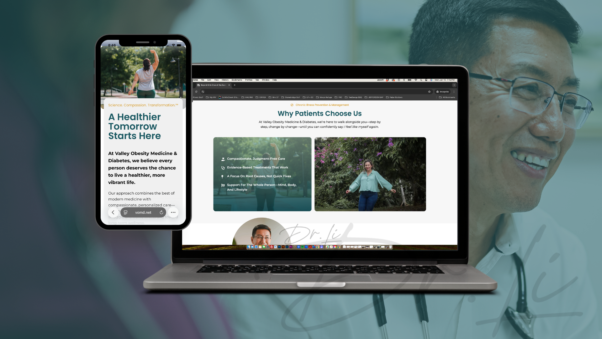
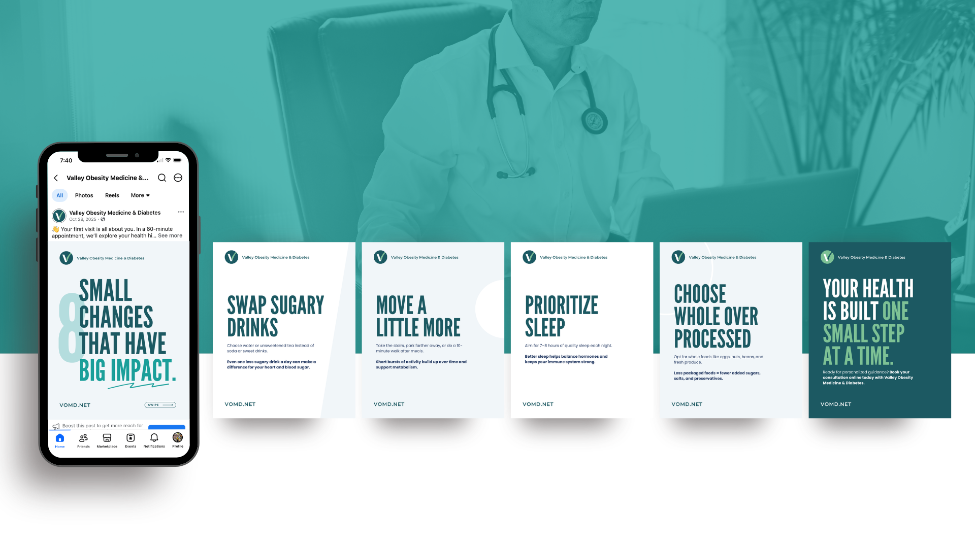
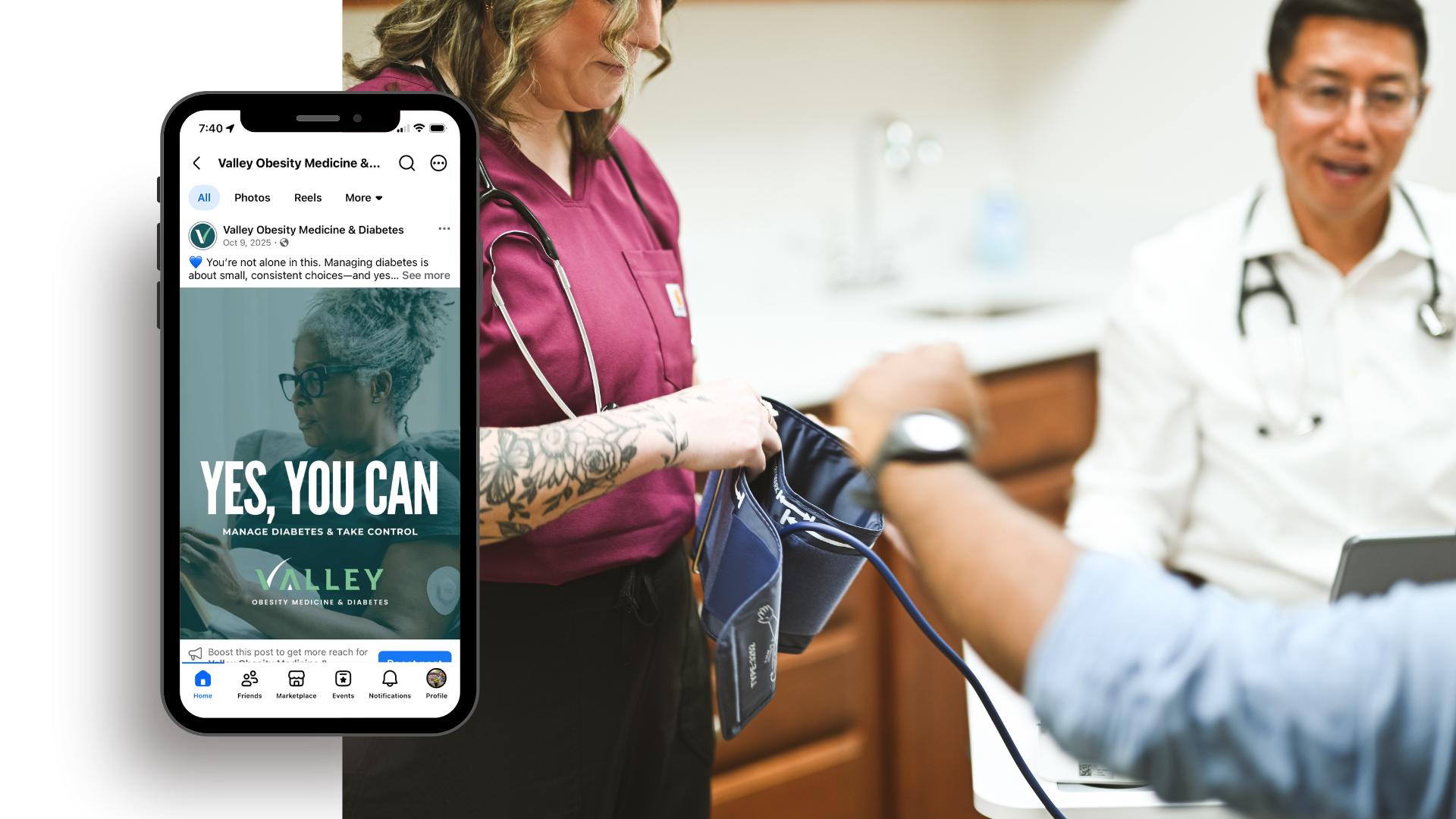
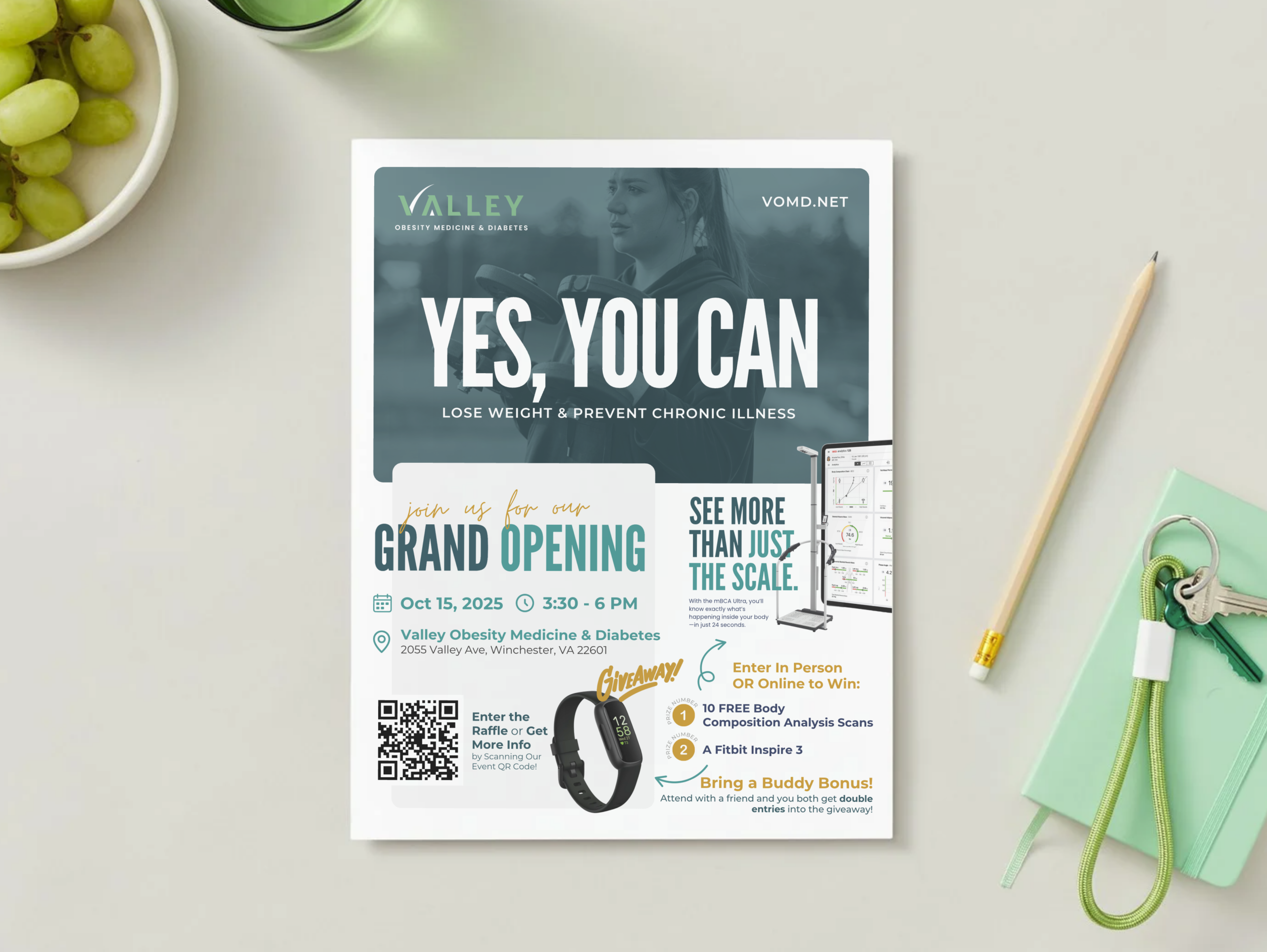
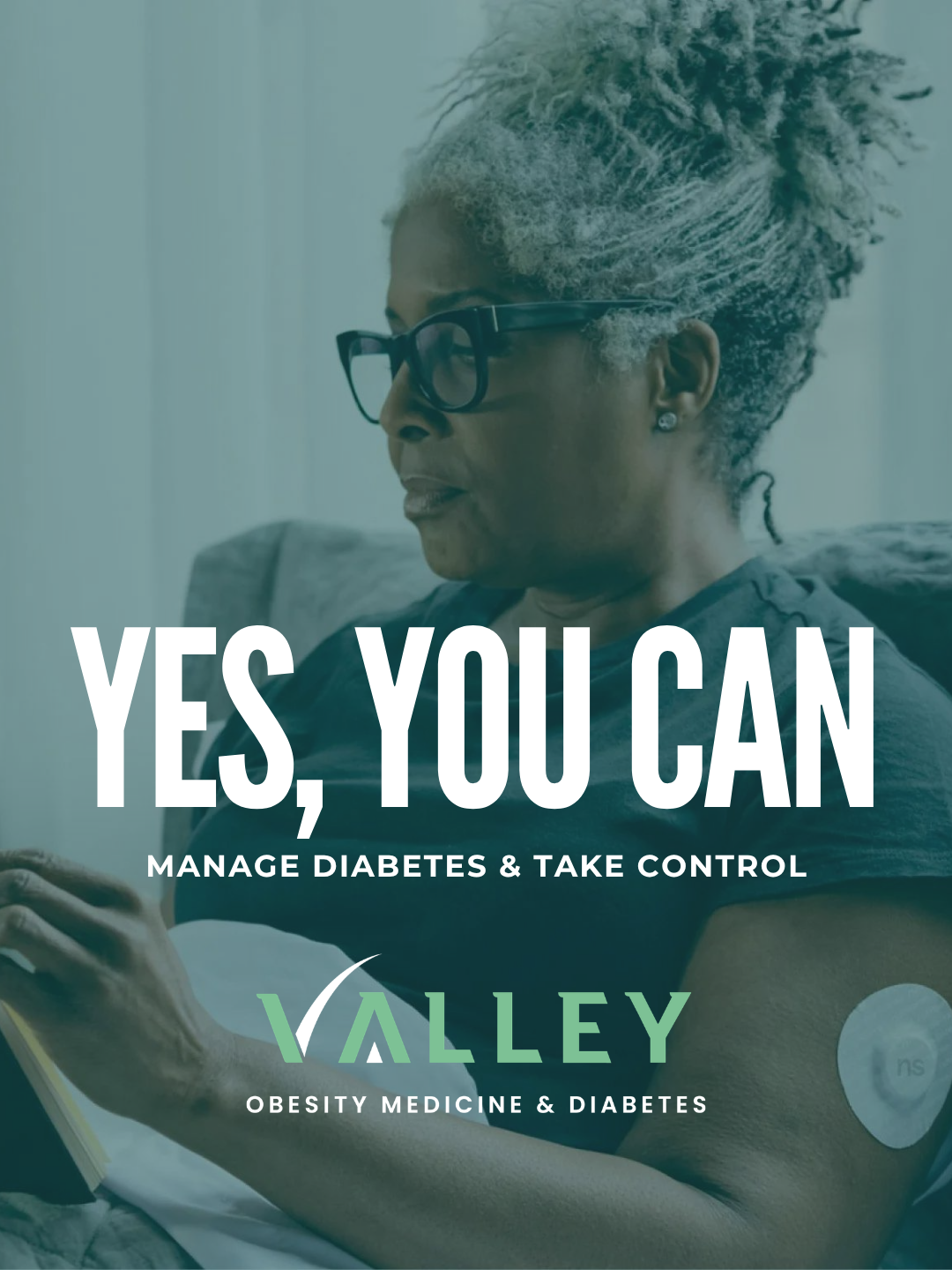
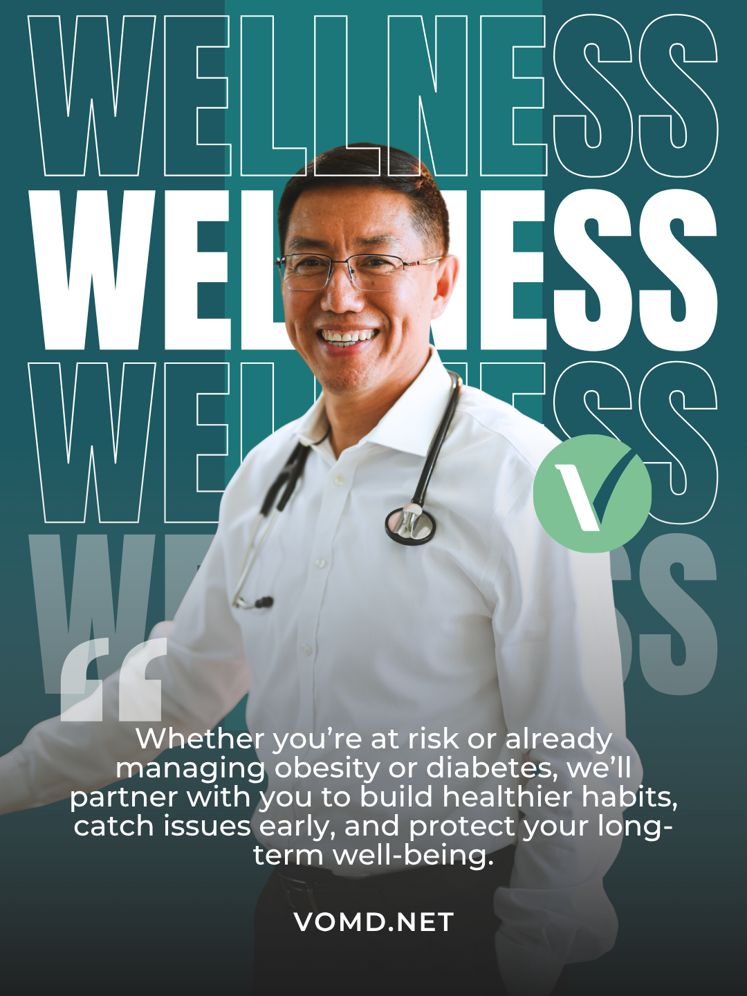
Then we expanded that foundation into a cohesive visual language VOMD could use across its website, marketing materials, social content, signage and patient-facing communications. Typography, color, layout, imagery and supporting graphic elements were brought together to make the practice feel intentional, contemporary and medically credible—without becoming cold or overly clinical.

That last piece was especially important.

Dr. Li was building a practice around a compassionate view of obesity: health over the number on a scale, treatment over blame, and support over stigma. The brand needed to feel professional enough to earn a patient’s trust while still feeling approachable enough to start a conversation many patients may have spent years avoiding.

The result wasn’t a dramatic rebrand designed to erase what came before it.

It was something more appropriate for VOMD: a thoughtful evolution.

We took an existing identity, corrected the inconsistencies, elevated the presentation and built the visual system it needed to grow.

Because before we could ask patients to trust the brand, we needed to make sure every detail gave them a reason to.

Ready to Dive in?

We’re All Ears.

Got a laundry list of marketing headaches? A wild idea you’re ready to chase? Big dreams that need a solid plan?

Let’s talk about what’s really holding you back – and how we can help you push through it.

This field is for validation purposes and should be left unchanged.

Questions You Might Be Asking

A real human, not an AI

Got a project brewing?